
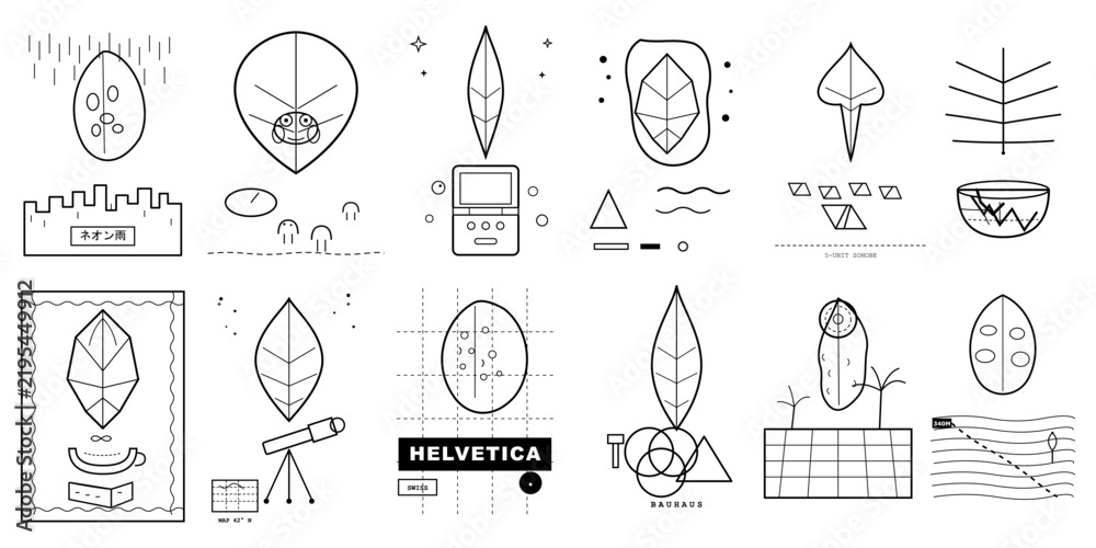
Icon trends come and go — skeuomorphic, flat, neumorphic, gradient — but Swiss Design principles from the mid-20th century have quietly outlasted all of them, because the underlying idea was never about decoration in the first place. This Swiss Design Inspired Icon Set on Adobe Stock is built entirely around that philosophy: grid-based structure, functional clarity, and zero unnecessary ornamentation.
What Makes Swiss Design Different From "Minimalist"
A lot of design gets labeled "minimalist" simply because it's sparse. Swiss Design (also called the International Typographic Style) is more specific than that — it's built on strict grid systems, objective and legible typography, and the idea that a design's structure should be immediately obvious rather than hidden behind style. Applied to icons, that translates into shapes that are instantly readable at a glance, without relying on color, texture, or decorative flourish to carry meaning.
Where a Set Like This Gets Used
- UI and product design — dashboards, settings menus, and navigation systems that need clarity above all else
- Editorial and publishing layouts — magazines, annual reports, and portfolio sites built on strong grid systems
- Brand identity systems — companies wanting a timeless, design-literate visual language rather than a trend-driven one
- Presentation decks — pitch decks and investor materials that benefit from a serious, considered visual tone
- Wayfinding and signage — the same clarity principles Swiss Design pioneered for public transit and institutional signage still apply directly here
Why This Style Tends to Age Well
Because Swiss Design was never chasing a visual trend to begin with — it was solving a communication problem — icon sets built on these principles don't date the way trend-driven styles do. A dashboard built with a currently-fashionable icon style often looks noticeably dated within a couple of years; a grid-based, functionally clear icon set tends to hold up because it was never trying to look "current" in the first place.
What You're Getting
As with other Adobe Stock vector sets, this comes as scalable vector artwork alongside a high-resolution raster file, so the same crisp, precise lines hold up whether you're using an icon at 16px in a UI or blown up large on a poster or signage system.
Licensing, in Plain Terms
Like all Adobe Stock assets, this set is available under a standard royalty-free license for typical commercial use — apps, websites, branding, and marketing materials — with an extended license option for broader usage needs. Pricing depends on whether you buy it as a single image or draw from an Adobe Stock subscription plan's monthly image credits, so it's worth checking current pricing and the exact license terms directly on the product page.
Who This Is a Good Fit For
This set is a strong pick for UI/UX designers who want icon clarity that holds up under real product use, brand designers building a serious, design-literate identity system, and editorial designers working within strong grid layouts. If your brand voice is playful, whimsical, or highly decorative, this austere style will likely feel like the wrong fit — but for anything aiming at clarity, precision, and timelessness, it's hard to do better than the design language that invented those goals.
Vector + high-resolution raster included · Standard and extended licenses available




0 Comments